This may not come as a surprise to experienced e-marketers, but the truth is that 7 out of 10 users abandon their shopping cart after adding the products they want to buy; even on your website.
Keeping this in mind, implementing good practices to decrease the cart abandonment rate is a top priority for any eCommerce looking to increase conversions and revenue.
Outline
- Introduction
- What is a shopping cart and why you need to optimize it
- Which is the critical phase we need to focus our attention on
- 4 tips to get the best out of your shopping cart page
Have you ever stopped to analyze whether your eCommerce shopping cart page is truly optimized to materialize the desired conversions? Every day, there are more and more people who decide to create their eCommerce and sell their own products. In fact, experts claim that online shopping is increasingly being more preferred than offline stores.
Therefore, any owner of an eCommerce must strive to be the best and that entails designing a usable eCommerce shopping cart that ensures a great customer experience.
Importantly, having an efficient shopping cart design plays a main role, not only in reducing the number of abandoned carts but also in increasing customer loyalty opportunities.
In your shopping cart page, there may be some elements poorly designed that need a creative face wash that ensures optimization of your eCommerce.
In this article, you are going to learn the keys to design a usable and powerful shopping cart page.
What is a shopping cart and why you need to optimize it
The so-called shopping cart is the name given to the URL that collects the orders from customers in an online buy/sell business.
Its function is to make it easier for users to visit a website and add to their shopping cart all the items they want to buy, from the product page of your website. Once you have them all, you only have to go through the checkout and pay, just like in a common physical supermarket, but thanks to the internet, you can go shopping from home.
Which is the critical phase you need to focus your attention on
In spite of the fact that the user who initiates the process is convinced that he wants to buy, usually during the same process, numerous abandonments take place. This can be quite surprising since the user had indeed made the decision to buy. In order to reduce the shopping cart abandonment rate as much as possible, the company must analyze which aspects push users not to complete the operation and, of course, adopt the necessary measures to correct them and improve the conversion rate.
To emphasize this aspect, we will take as a starting point – the beginning of the transaction. That is when the potential consumer has already chosen the product, the model and the color (among other aspects), has accepted the price, the delivery times and the conditions of purchase, and is ready to acquire it.
The reason why we need to focus on this phase is that we’ve already managed to capture the user’s attention and, in addition, we’ve gained their interest in one or more of our products:
- The user has already browsed the website, so the attention phase is over.
- The user has shown interest in one or more of our products by performing the add to cart action.
It is essential to transmit confidence to new customers so that they can continue with the order. And to do this, you have to put yourself in their shoes and analyze their possible doubts. These can be:
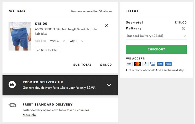
- Whether you see the final price of each product.
- The total of the purchase.
- Whether there are shipping costs and, if so, the price.
- Shipping methods.
- The estimated time to receive the products.
- Whether they can be returned or not.
4 tips to get the best out of your shopping cart page
#1 Make the link to the shopping cart visible
While the consumer is shopping, it is important to show it in a visible place (e.g. in the form of a shopping cart to the right of a menu with ‘position: fixed’). In this way, we offer two benefits to the user:
- Updated information about the shopping cart, such as the number of items included or the final price so far.
- The option to finish the purchase at any time by clicking on the shopping cart icon.
#2 The beginning of the purchase process should be attractive
As in everything, the beginnings are key, as they will lead the way until the end of the process. Therefore, if the beginning of the payment process is friendly and the customer feels comfortable and secure, he will finish his purchase.
Always remember to make each step very clear and which data to add, without any ambiguity.
#3 Use the ‘ADD TO CART’ button for your cart page
One of the most widespread mistakes in e-commerce is the use of ‘Buy’ buttons on product cards, instead of ‘Add to Cart’. Is there a difference between these names? Of course! And the error is doubled if the link does not allow the user to continue shopping, but it leads to the checkout process of the cart instead.
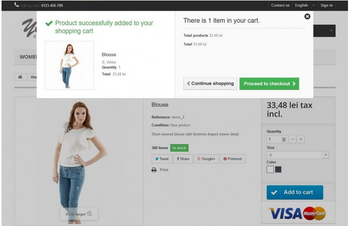
Furthermore, if you are willing to bring your cart page to another level, there is also a very clever idea for the shopping experience. When a customer puts a product into the cart, a little layer expands on the right side, which incorporates the “Checkout/Buy” button. Using this feature, a customer can go directly to the checkout pages with actually no effort. This is an impressive solution, especially when it comes to encouraging impulse purchases.

#4 Use clear and simple designs in your checkouts
A lot has been written about the impact of design, color palette, or typography on consumer purchasing decisions. According to the Colour Marketing Group, 8 out of 10 consumers choose one product over another based on color. The chosen design in checkout processes cannot be taken lightly. The design in the checkout process shouldn’t be overlooked when it comes to the functionality of an eCommerce store.

In general, it is preferable to use clear and simple designs that not only match with your eCommerce brand but also accentuate the buttons and key checkout fields: H2 titles, CTAs, possible payment options, etc. It is important to avoid designs that are confusing, messy, and too many elements. When talking about design, as usual, less means more.
References
https://www.webdesignerdepot.com/2009/04/10-tips-to-design-usable-shopping-carts/
https://www.goinflow.com/ecommerce-cart-checkout-design/
https://ecommerce-platforms.com/ecommerce-selling-advice/12-e-commerce-sites-inspirational-checkouts
